I’m an engineer. I’m also OCD about tracking things. Combine those two traits and you get some interesting — albeit sometimes odd — results.
Take, for example, the fact that I once calculated how much I save by taking my bike to work over driving, after accounting for the cost of the extra food I consumed on days I biked. (Spoiler: it was a 15-mile bike ride each way, so those calories were non-trivial.)
So yeah, sometimes I go a little overboard with the data tracking thing. But sometimes, I can also do some cool things with that data.
Case in point: creating a heat map of my life.
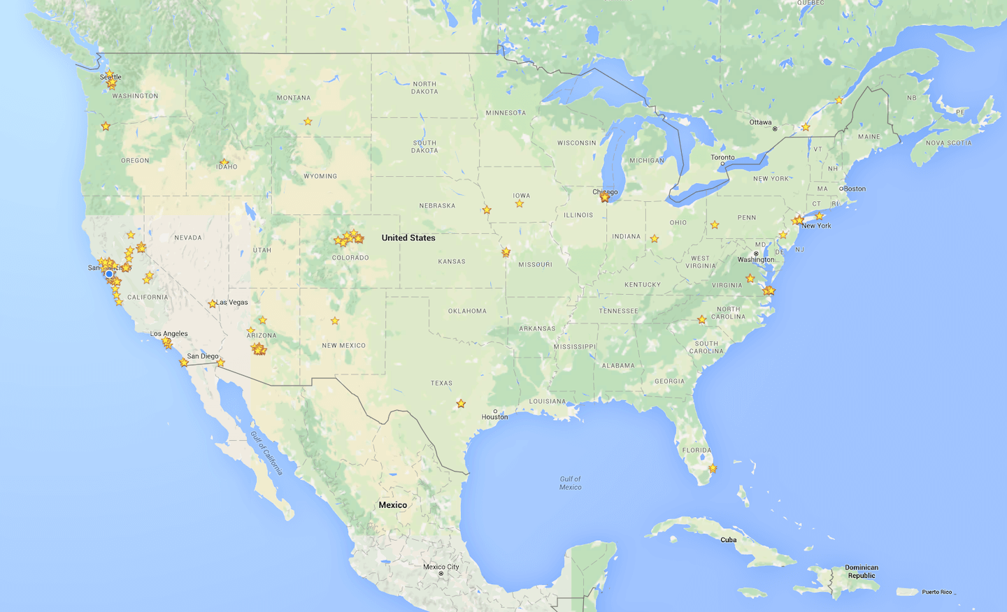 A simple looking map with curious stars scattered across it.
Setting the stage
Towards the start of 2012, two important things happened in my life: I acquired a love for trying new places to eat, and I acquired the funds to start eating at those new places.
Love for new places
My wife and I started dating in 2011. I didn’t know this before we started dating, but it turns out her family runs an awesome popcorn company. (Dreams really do come true.)
The more I learned about the sweat equity her family put into that business, the more inspired I became to support local restaurants and shops over chains. Local restaurants and shops are a labor of love, sweat, and tears; big chains are an exercise in unit economics, clever marketing, and mass market appeal.
My wife was already a big proponent of supporting local restaurants, but I took it to a whole new level. Not only did I stop frequenting chain restaurants, but over the past several years I’ve done my best to never go to the same restaurant twice. I make an exception for local coffee shops or sports bars, but even then I only do so after patronizing all of the ones in my area.
Funds to start eating
In 2011, I graduated from college with a degree in Mechanical Engineering. I had spent the previous four years studying my butt off, working odd jobs, and living on just-add-water pancakes and the occasional quesadilla.
I’m not joking about the pancakes, either. During my senior year, I bought a 10-pound bag of instant pancake mix from Costco and made those for breakfast, lunch and dinner nearly seven days a week.
I started my foray into the real world in the fall of 2011. It took me a while to build up a safety net, but given the job (Boeing) and the affordable locale (Phoenix), I felt comfortable eating out a little more frequently after a year or so.
The heat map
As I ramped up my non-pancake eating and cultivated my love for trying new places, I began to star every place I ate on Google Maps.
Every. Single. One.
To date, I’ve starred nearly 1,000 different places across the country. I also rate and review each place, so if you happen to see a review by “Mitchell Lee, Local Guide” pop up when Googling for restaurants… hi 👋 (At this point I’m relatively confident I’m among the most prolific reviewers on Google Maps.)
The result of my incessant starring? A very pretty map that looks like this.
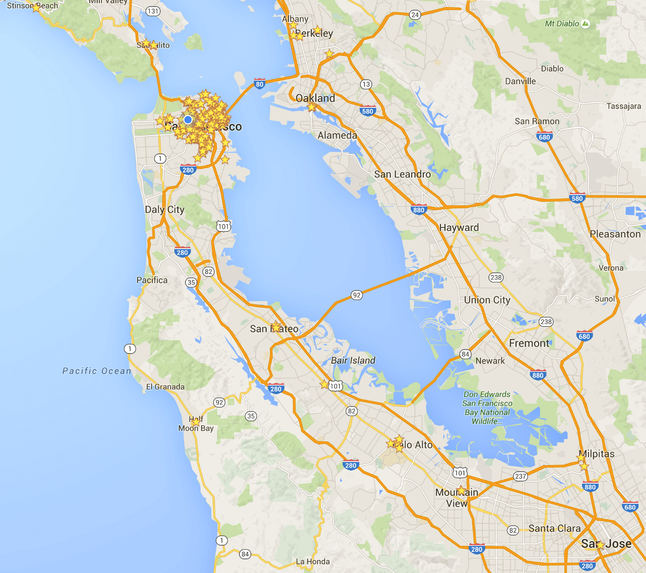 I eat a lot of food.
But why?
Great question. For one, because I’m OCD and that’s what people like me do.
That’s not the only reason, though. Here are a few more:
- Every time I open Google maps, I’m greeted by stars! 🌟
- I get free perks because Google now considers me a “Local Guide.”
- Restaurant recommendations for friends are only a few clicks away.
- I have a way to jog my memory about places I’ve eaten at before.
But most importantly, this has become a heat map of my life. Keeping in mind that almost every meal out results in a new star, it follows that
the higher the density, the more time I’ve spent there.
With that fresh perspective, I can draw some interesting conclusions.
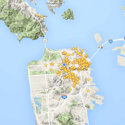
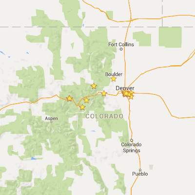
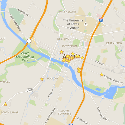
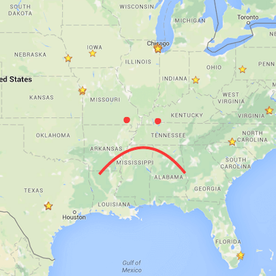
- A stranger with access to a zoomable version of this map could easily deduce which places I’ve lived since 2012. That’s not creepy.
- For as much as I love traveling, I have so far turned a blind eye to the south.
- Clearly I’m only interested in Denver for its mountains.
- In my one weekend there, I did damage in Austin.
- Apparently I went to Albuquerque once.
What’s next?
I’m not sure! If you have any creative ideas about what to do with this data (stars, numerical ratings, or both), let me know!